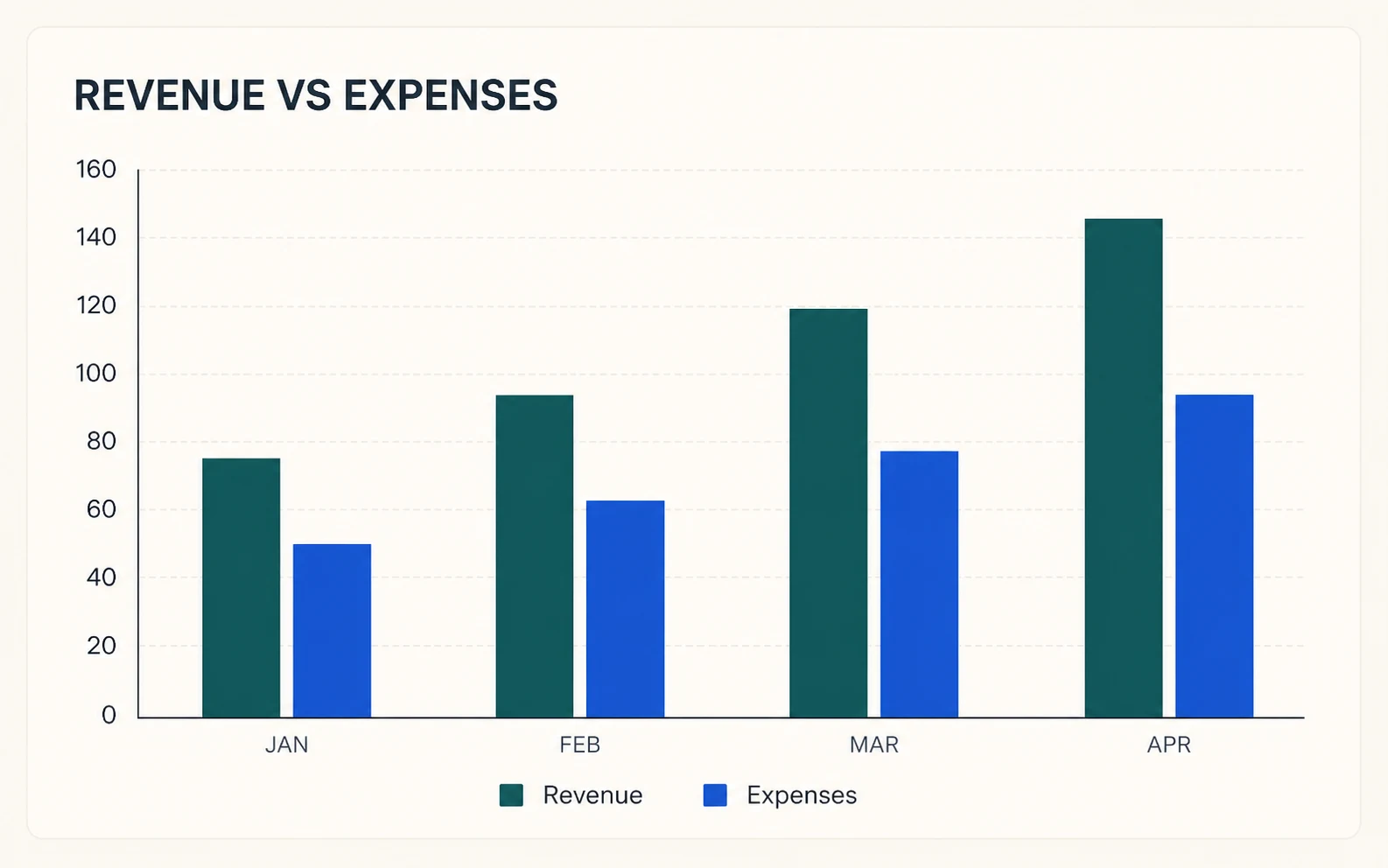
Build Business and Finance Reports
Compare revenue, expenses, profit, budgets, regions, or monthly KPIs without rebuilding a chart by hand in a spreadsheet.
 FigEditor
Browser-based data visualization tool
Paste spreadsheet data or upload CSV, then create grouped, stacked, and 100% stacked charts. Every bar is rendered from your values in the browser—no image credits and no invented data.
Chart data
First column is labels; remaining columns are numeric series.
Your table stays in this browser. Values are converted directly into SVG geometry; no image model receives the data.
Exact SVG preview
Categories: 6 · Series: 3
Turn compact categorical data into a visual that is easy to compare, verify, download, and reuse.
Compare revenue, expenses, profit, budgets, regions, or monthly KPIs without rebuilding a chart by hand in a spreadsheet.
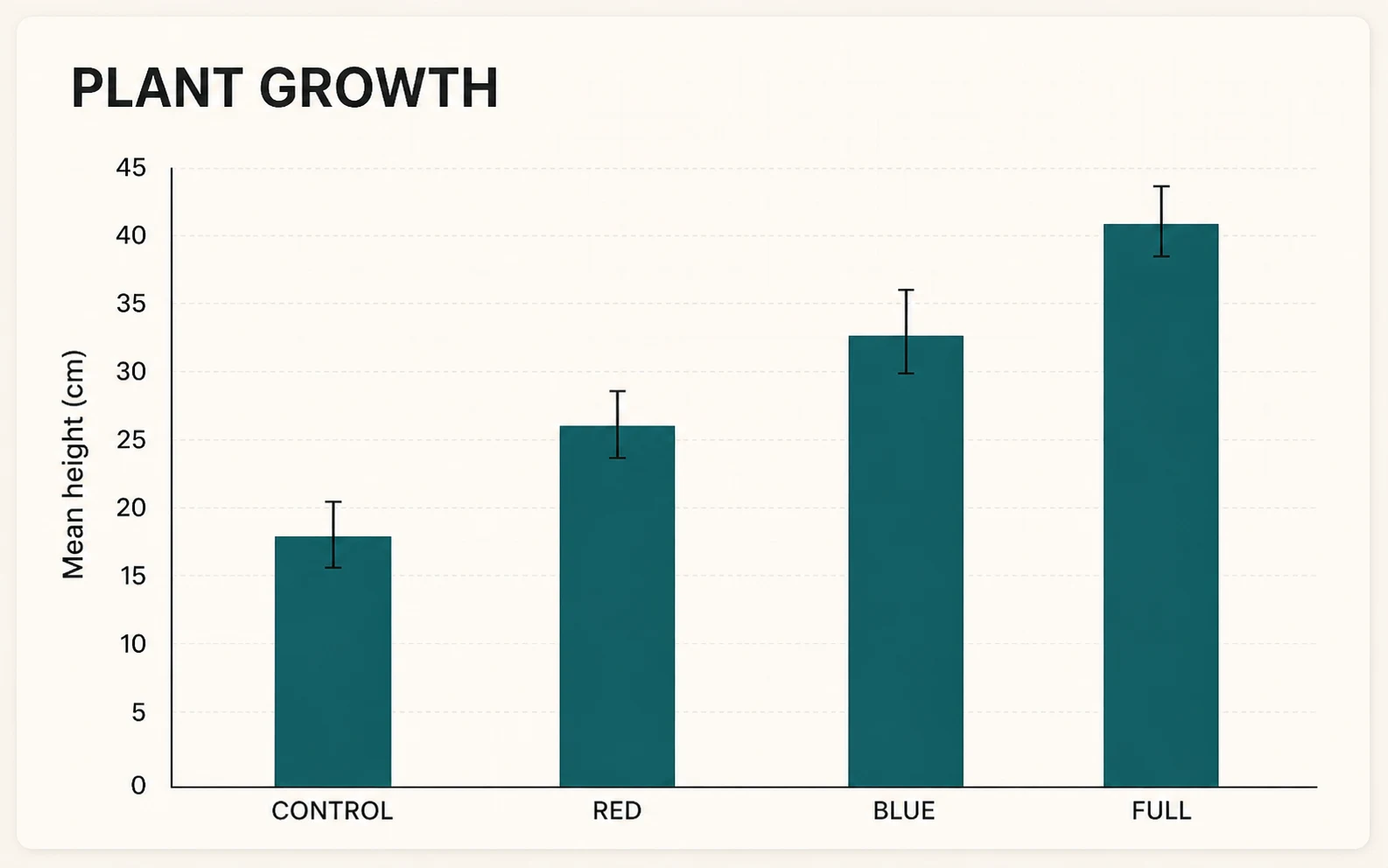
Create a clear zero-baseline chart for experiment groups, survey responses, or measurements while keeping every value traceable.
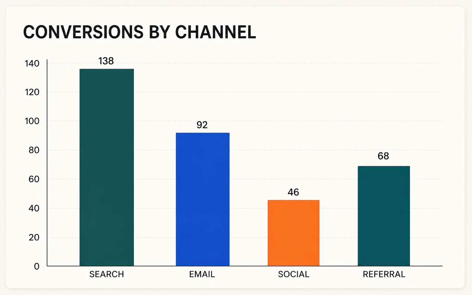
Download crisp SVG or PNG charts for a report, slide, worksheet, poster, article, or client update.
02 COLUMN CHART CAPABILITIES
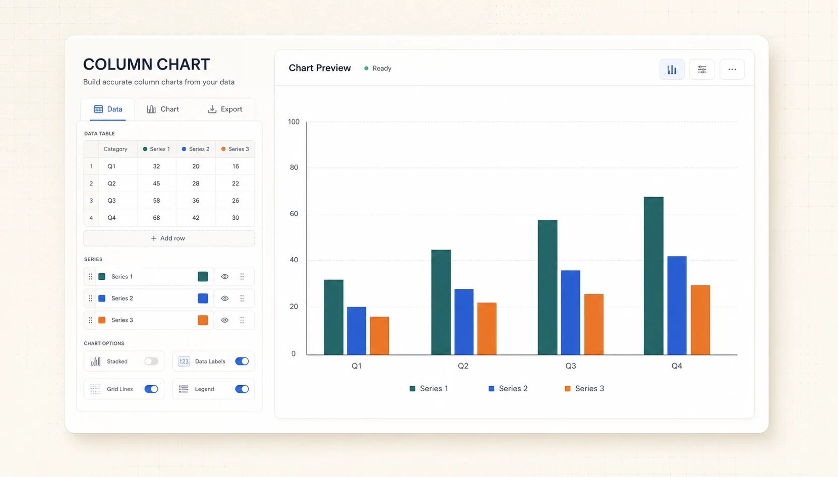
Put category labels in the first column and numeric series in the remaining columns. The preview updates immediately as you edit.
Use grouped columns for side-by-side comparison, stacked columns for totals plus composition, or 100% stacked columns for proportions.
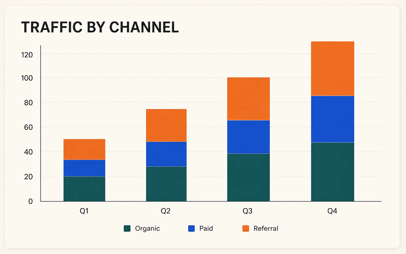
Export a sharp vector chart for editing, a high-resolution PNG for quick use, or the data file that produced the chart.
A data chart should not guess. FigEditor renders the chart geometry directly from the table in your browser so the visual stays inspectable and repeatable.
Every bar and stacked segment is calculated from the visible numeric cells instead of being painted by an image model.
The vertical scale starts at zero by default so category differences are not exaggerated by a cropped axis.
CSV parsing and SVG rendering happen locally in the browser; the generator does not upload your table to create the chart.
Finish a common data-visualization task quickly without losing accuracy, privacy, or control over the output.
Edit a number or label and the SVG preview updates immediately, without a generation queue. Real-Time Preview
Paste rows from Excel or Google Sheets instead of learning a new chart specification or design tool. Spreadsheet-Friendly
Precise chart rendering runs in the browser, so ordinary column charts do not consume AI image-generation credits. No Image Credits
SVG output preserves clean axes, legends, labels, and column edges at any presentation or document size. Vector Quality
Move between grouped, stacked, and proportion views while keeping the same source data and series colors. Three Layouts
The chart is produced locally from the data you can see and download again at any time. Private by Default
Paste or upload a table, choose the comparison layout, then download the exact chart you see.
Use the first column for category labels and the remaining columns for numeric series. CSV, TSV, and copied spreadsheet rows are supported.
Pick the layout that matches the question, sort categories when useful, and adjust labels, grid lines, title, and color palette.
Check every value and label, then export SVG for editing, PNG for quick sharing, or CSV to keep the source data with the chart.
Both compare categories. The direction of the bars determines which labels and comparisons remain easiest to scan.
VERTICAL COMPARISON Best for short labels, months, quarters, compact dashboards, and a small number of categories that readers compare from left to right.
HORIZONTAL COMPARISON Better for long category names, rankings, many categories, and labels that would become cramped or rotated on a horizontal axis.
Simple pricing
Choose a plan designed for the way you communicate research.
For individual researchers who need the complete visual workflow with a practical credit allowance
Start creatingFor researchers who need more iterations, commercial use, and every advanced visual workflow
Start creatingFor teams that need high-volume credits, commercial use, and support across the full workflow
Start creatingPaste spreadsheet rows into Column Chart Maker or upload a CSV, keep category labels in the first column, and place each numeric series in the remaining columns. Choose grouped, stacked, or 100% stacked mode, review the preview, then export the result as SVG, PNG, or CSV.
Copy the required cells from Excel or Google Sheets and paste them into the data box, or upload a CSV, TSV, or text file. The uploader accepts text-based CSV or TSV rather than .xlsx files. The header row names the series, the first column supplies labels, and remaining numeric columns become plotted series.
Column charts use vertical bars and suit short labels, time periods, and compact left-to-right comparisons. Bar charts use horizontal bars, giving long category names and ranked lists more room. Choose the orientation that makes labels readable without rotation or truncation.
Choose Grouped to place series side by side, Stacked to combine series into category totals, or 100% Stacked to normalize each category for proportion comparisons. The same source table drives every mode, and the editor supports up to six numeric series without requiring values to be entered again.
A zero baseline keeps bar-length comparisons honest because cropped axes can exaggerate small differences. Column Chart Maker starts the vertical scale at zero by default and draws a visible zero line when grouped data includes negative values, preserving the direction and relative size of every column.
CSV parsing, chart calculation, and SVG rendering run in your browser, so the generator does not send the table to an image model or chart API. Downloads are created locally as well. Treat the exported file according to your organization’s data-handling rules if the source values are sensitive.
Select SVG in the chart preview to download a scalable vector file containing the chart’s text, axes, labels, legend, and column shapes. Use PNG for slides or documents that only need a finished image, and retain the exported CSV alongside the chart for traceability.
Use Column Chart Maker when exact source values, deterministic bar heights, and editable SVG output matter. Use AI Chart Generator for broader visual exploration from an unstructured brief or when you need help choosing a chart direction, then verify every generated label, scale, and value.
Paste the data, choose the right column layout, review every value, and download an accurate SVG or PNG in minutes.
Column Chart Maker →