 FigEditor
AI Chart Generator for Reviewable Chart Visuals
Use the AI Chart Generator to paste rows from Excel or CSV, enter text values, or describe a chart. It creates an image-based visual draft that you can refine in FigEditor; it does not directly parse spreadsheet files, and every label, axis, and data point still requires review.
✓ Paste Excel, CSV, or text values
AI Chart Generator
84 / 3,500
Preview
Grouped Bar Chart
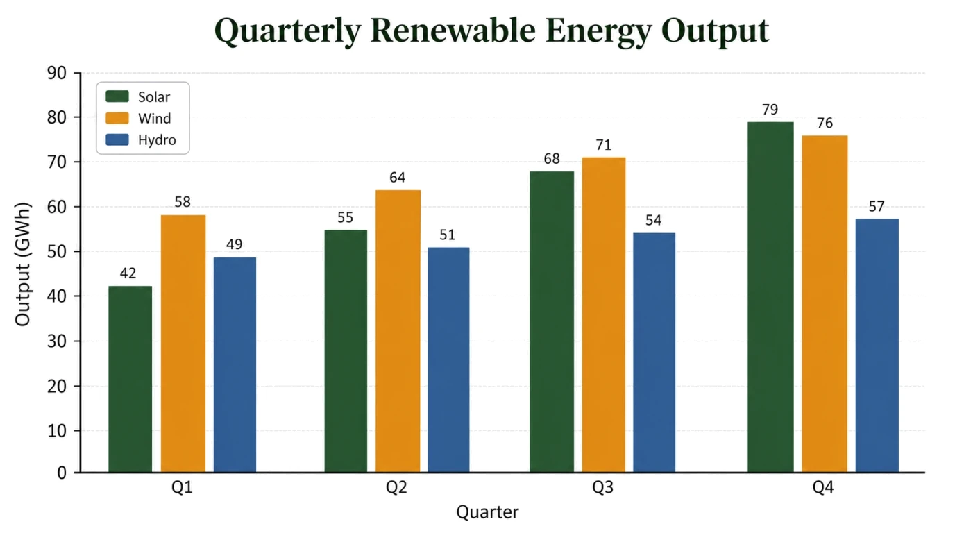
Compare quarterly categories on a shared zero baseline with exact value labels.
AI creates an image-based draft. Verify every value, label, axis, and statistical claim before using it.
Examples
Paste Excel, CSV, or Text Values into Chart Drafts
Paste selected spreadsheet rows or structured text to draft a focused chart for a report, research figure, lesson, or presentation without arranging every axis by hand.
Draft Scientific and Academic Charts
Create Presentation-Ready Data Visuals
AI Graph Maker for Reports and Research
02 CHART WORKFLOW
Turn Pasted Rows into a Chart Draft
Paste categories, dates, values, units, and the comparison you need from Excel, CSV, or text. Exact labels and a clear chart goal make the result easier to verify.
Keep Scales, Error Bars, and Claims Honest
State the required baseline, axis range, uncertainty, sample size, and verified statistical annotations. Never ask the model to invent missing measurements or significance.
Refine Labels, Color, and Layout in FigEditor
Open the draft in FigEditor and continue with focused revisions to labels, hierarchy, color, spacing, or annotations before export.
Check Data, Axes, and Statistical Claims
A convincing chart can still be wrong. Treat every generated image as a visual draft and compare it with the source before using it in a report, paper, or presentation.
Match Every Mark to a Source Value
Check each bar, point, line, percentage, category, date, and unit against the data you supplied.
Review Baselines and Axis Ranges
Confirm that the scale does not exaggerate small differences, hide variation, or imply a comparison the source cannot support.
Add Only Verified Statistical Claims
Use error bars, p-values, trend lines, and sample sizes only when those values already come from a valid analysis.
Why Use an AI Data Visualization Generator?
Move from pasted spreadsheet rows or a written brief to a readable chart draft while keeping source review and practical output in view.
Generate a Chart Direction Faster
Turn structured values into a concrete chart draft before spending time on manual axis setup, labels, legends, and styling. Faster First Draft
Start from the Question the Chart Must Answer
Describe whether readers should compare categories, follow change over time, inspect a relationship, or understand parts of a whole. Clear Chart Intent
See the Model and Credit Cost Up Front
Choose the generation model and resolution while seeing the credit cost before the chart draft is created. Transparent Credits
Use Exact Values, Labels, and Units
Supply the wording and measurements that must stay unchanged, then compare every plotted element with the original source. Data-Specific Input
Continue Refining the Generated Chart Draft
Keep the useful composition and make focused changes to labels, annotations, emphasis, color, or layout in FigEditor. Reviewable Workflow
Keep Human Review in the Loop
Verify calculations, axis choices, uncertainty, sample sizes, statistical claims, and visual implications before export. Human Verification
How to Make a Chart with AI in 3 Steps
Paste structured values from Excel, CSV, or text, describe the comparison, then generate and review the chart before using it.
Step 1: Paste the Data and Exact Labels
Provide categories or dates, values, units, and any verified uncertainty or sample-size information. This page currently accepts pasted text plus optional image references.
Step 2: Describe the Chart Goal and Format
Say whether the visual should compare categories, show a trend, display proportions, or inspect a correlation. Specify the chart type only when you already know what fits.
Step 3: Generate, Verify, and Refine
Compare every mark with the source, check the axis and legend, remove unsupported claims, then continue refining the visual draft in FigEditor.
Simple pricing
Create more. Explain better.
Choose a plan designed for the way you communicate research.
Basic
$19$9.5/month
For individual researchers who need the complete visual workflow with a practical credit allowance
Start creating- 5,040 credits per year
- ≈ $0.18/image
- All scientific figure tools
- High-resolution PNG exports
- Commercial use included
Plus
$39$19.5/month
For researchers who need more iterations, commercial use, and every advanced visual workflow
Start creating- 12,960 credits per year
- ≈ $0.14/image
- All scientific figure tools
- High-resolution PNG exports
- Commercial use included
Enterprise
$69$34.5/month
For teams that need high-volume credits, commercial use, and support across the full workflow
Start creating- 28,800 credits per year
- ≈ $0.12/image
- All scientific figure tools
- High-resolution PNG exports
- Commercial use included
Frequently asked questions
How do I make a chart with AI from text?
Paste categories or dates with their values, units, and exact labels, then explain what readers should compare or understand. The AI Chart Generator creates a visual draft from that text. Check every mark, legend entry, axis, and annotation against the source before refining the chart in FigEditor.
How can I create a chart from Excel or CSV data with AI?
Copy the relevant rows from Excel or a CSV file and paste them into the prompt with clear headings, values, units, and ordering. This page does not directly parse spreadsheet files yet. Use a concise, verified subset, describe the comparison, and review the generated chart against the original cells.
What chart types can the AI Chart Generator create?
The AI Chart Generator can draft bar, grouped bar, line, pie, donut, scatter, and time-series charts for business and research use. More complex requests may work, but the format must match the question and data structure. Review the selected chart type instead of assuming the first draft is appropriate.
Can the AI Chart Generator recreate a chart from an image?
Add a JPG, PNG, or WebP chart as a visual reference, then describe the labels, values, units, and changes you need. A reference image can guide the composition, but it is not a reliable data source. Supply the exact numbers separately and compare the result with the original dataset.
Is an AI-generated chart accurate enough for research?
Treat every output as a visual draft, not a statistical calculation. Verify each plotted value, axis range, error bar, sample size, regression label, and significance claim against the original analysis. Use statistical software for computed results, then use FigEditor to review and refine the chart presentation.
Can I create scientific charts with error bars or p-values?
Scientific charts can include error bars or p-values when you already have verified means, uncertainty values, sample sizes, and statistical results. State each value and annotation location explicitly. Never ask the model to infer error bars, confidence intervals, p-values, or significance from incomplete data.
Is the AI-generated chart editable?
FigEditor opens the generated chart as a visual draft that you can continue refining. Keep the useful composition, then revise labels, annotations, hierarchy, color, spacing, or supporting elements. Because the first result is image-generated, compare the edited version with the source data before final export or publication.
How much does the AI Chart Generator cost to use?
Chart generation uses credits. The current credit cost appears beside the selected model and on the create button before submission, so you can review it before generating. Available plan allowances may change over time; check the pricing section for the current credit packages and account benefits.